


These are screenshots of my Nearpod Reflective Review.


ISO: 100 Aperture: F11 Shutter Speed: 1/125 Focal Length: 31.0m

ISO: 100 Aperture: F11 Shutter Speed: 1/125 Focal Length: 31.0m

ISO: 100 Aperture: F11 Shutter Speed: 1/125 Focal Length: 31.0m
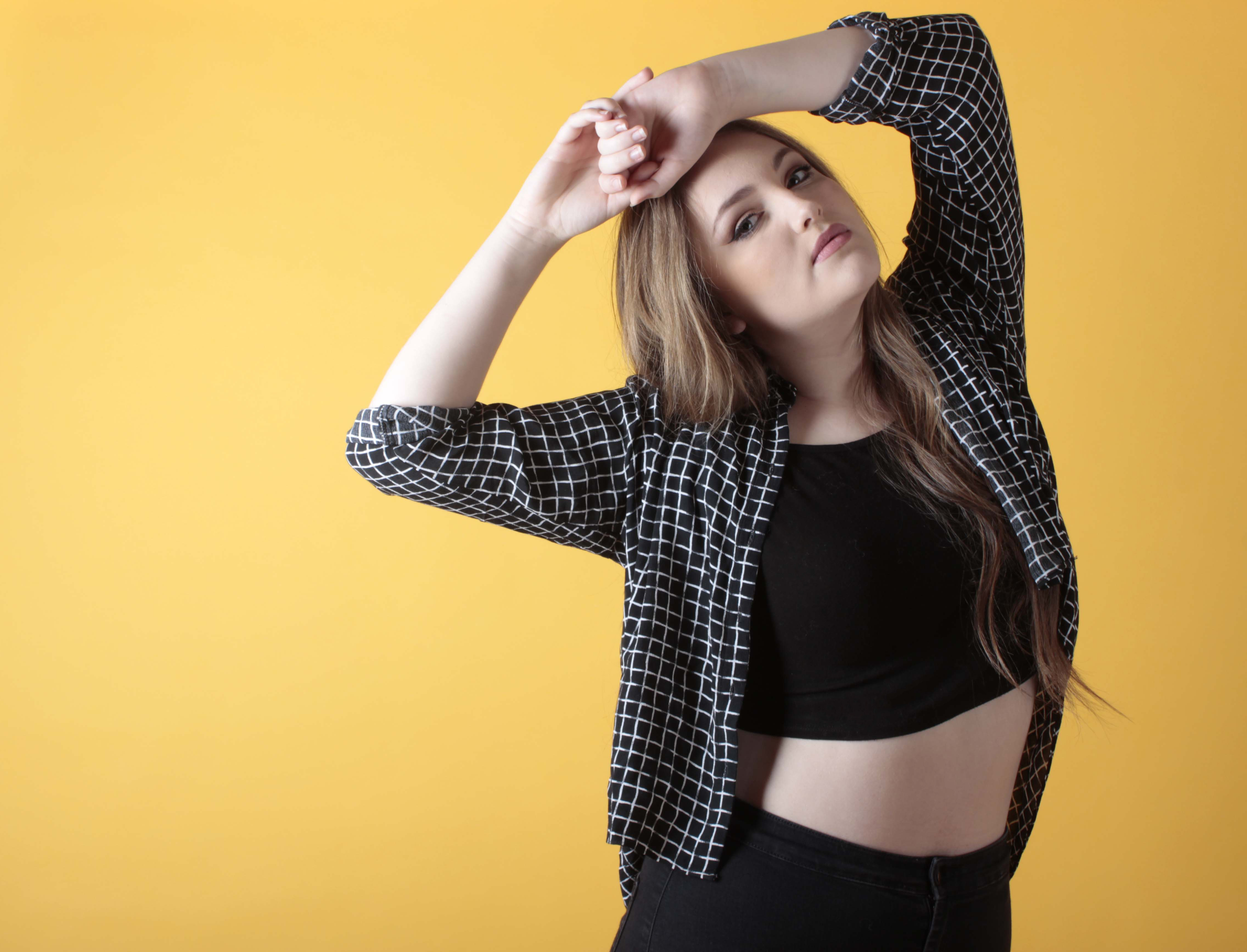
These are my final prints, I chose these because I personally think that these show the style of Seapunk. I like the first photograph because it highlights the makeup style of the subculture. The second photograph was chosen because I wanted to echo the well known pose for the iD magazine. In the last image I wanted to show the style of clothing that was used in my photo shoot so I chose this out of the 65 images that I took, as I felt this was the one that showed all of the clothing.
Images (Background):
1. http://www.worldofstock.com/stock-photos/ripples-in-crystal-clear-blue-water-horizontal/NWA1891
2. http://wiesigners.com/images/img7/water-tumblr-background-decorating-4jpg

Digital Lighting Set Up on Photoshop

The lighting set up

The light with a teal gel filter placed over it
The whole process of the final shoot took place on Friday 23rd of January in the studio and it took one and a half hours to set up the lighting, set the camera up, change my model and alternate between shots and makeup changes. All together I shot 60 images, with different styles of makeup and hair and different poses.
I changed the makeup design ideas, with keeping it simple, by using the same lips and eyes and changing the jewels instead. I also introduced two hair styles, scrunched pig tail and untied hair. I felt that the fringe was still too long for some of the makeup designs, especially the first one as the majority of the hair covered the jewel design on the forehead.
I feel that I could have done better in terms of trying to get the model to portray the attitude of somewhat similar to the subculture. I had watched music videos from the subculture to try to get a gist of the attitude but I couldn’t find a way to portray that to my model, and for her to then portray that to the camera. In the future I will use visual references to help the model with the type of attitude and body language that I want to portray in my work.
For this photo shoot, I used a large soft box and placed it on my left (the model’s right) and placed the light with the teal gel filter on my right (the model’s left), and used a white background, as I felt that using a black background would be harder to remove in post editing, as black has an unsteady gradient where as white has a steady gradient from white to grey. I thought white would be simpler to use as a base, whereas the black would have been difficult to erase. Through out the photo shoot, I had my model moving closer between the soft box and the gel filter, to create difference in shadows and highlights.

Test Shot
This is my test shot prior the photo shoot to quickly see what the highlights and shadows do against the body, creating depth in the photograph. I chose this pose, to get a general idea of how the lighting behaves against the body.
A Shot From A Session With Gel Filters (Red and Purple)

Gel Filters Used; Teal and Red
My inspiration from using the gel filters, was from my previous session based around playing with different filters and visualising which filter complimented each other. I used all of the gel filters; red, blue, purple, teal, and brown to see what would compliment the actual photo shoot. I used the teal gel filter for the photo shoot.
Overall, I think the photo shoot went as planned, but my creative imagination let me down as I struggled to think of different poses and compositions to shoot during the photo shoot. I did everything mentally, whereas in the future I will have visuals within the studio, to help both me and the model.
This is the video for behind the scenes of my Seapunk photo shoot. The model in question is not affiliated with the sub genre. This is a snippet of what happens in my photo shoots, using the college studio. This was a fun photo shoot to do. Enjoy.
“D&AD exists to stimulate, enable and reward creative excellence in design and advertising.” – D&AD
The competition, ‘New Blood’ by D&AD allows a purpose for young full/part time college students who finished their course within the past two years and is under the age of 24, to ‘address a real life challenge for a top international brand.’ Ideas generated by the competitors will be ‘seen and judged by the representatives of the brand’, as well as a panel of creatives from regions of the world.
There are a range of briefs that can be fulfilled, such as copyeditors, photographers, a digital specialist or product designer or in between. In order to create briefs for the candidates, the input to create the ‘best in business’ has been involved by industry experts and ‘top-notch brands’, to ‘curate a suite of briefs covering a wide range of creative disciplines and addressing real-world challenges for real clients.
The competition is a highly respected competition, reigning since 1962. There are two awards, the Yellow Pencil (formerly silver award), and the Black Pencil (formerly gold award).


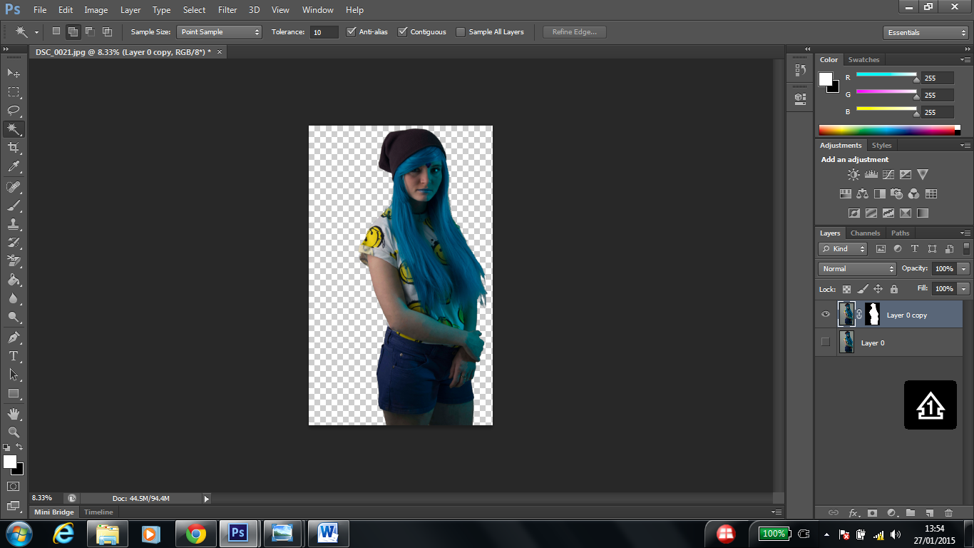
The unedited image on Photoshop
Firstly I opened the original unedited image on to Photoshop, and decided whilst viewing the image, what approach to take. I could take 3 approaches; editing the problematic skin, remove imperfections such as the gradient of the background and the wig, or begin with the removal of the background. The majority of the time, I began with the editing of the skin and then followed by removing the imperfections of the area surrounding the subject and lastly removing the background.

The skin imperfections unedited

The skin edited using the Spot Heal button
I had to take editing the imperfections such as stray hair, skin imperfections (as my model had a skin condition) and retouching using the spot healing tool, on the skin to remove dark circles and raised and discoloured skin. I struggled with the bad areas of dry skin, especially on her elbows and especially where there was the shadows coming from the blue gel filter. I used a combination of layers above the area, cloned a part of her skin that was normal, and covered the problematic area with the clone tool and turned the opacity down. The reason I did this is there was a soft line between the two shadows and where I had edited, it became ugly and blurry with using the Spot Healing Tool repeatedly.
I then used the Clone Stamp to clone the background and place it over the single stray hairs, and used the tool to cover up gaps in the wig, where the hair had fallen on the face or head and on the hat that the model was wearing as well.

Un-cropped image with the crop tool over it giving me a guidance of what the image would look like

The result in using the crop tool
Then I looked at my composition, and cropped the image to the composition I wanted using the cropping “shadow” as a guide (such as cropping the space above the model for a compact composition). I try not to crop my work, but I felt that the above image would have suited a compact composition.

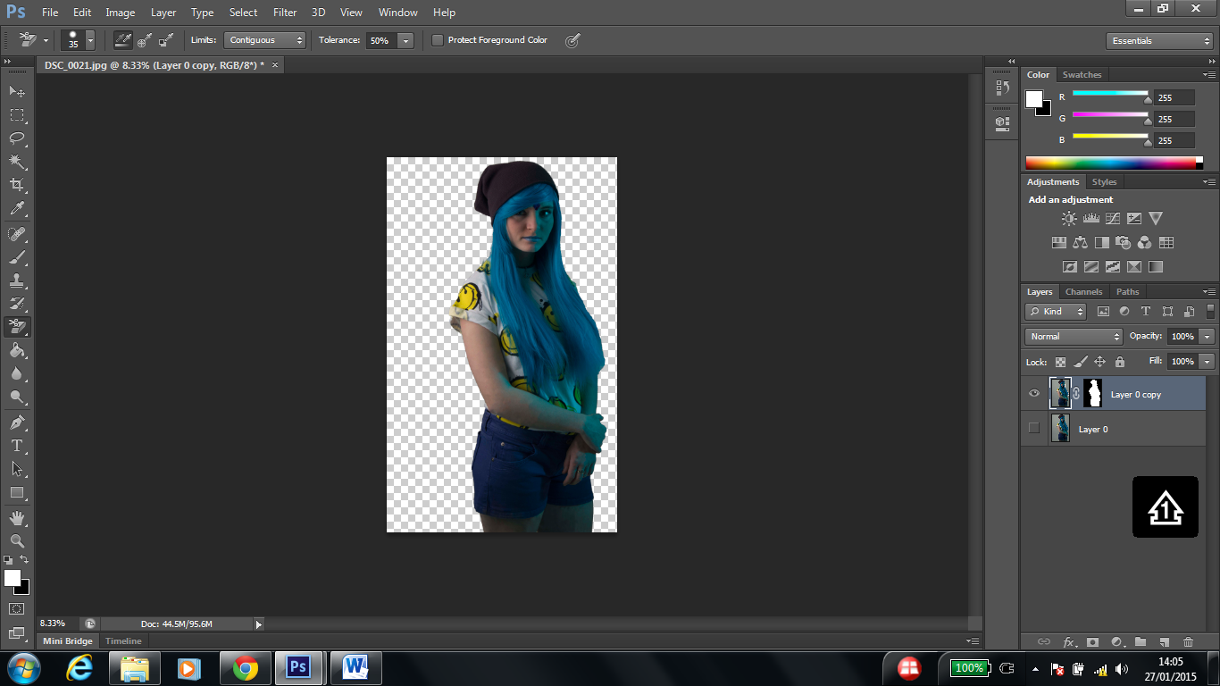
The magic wand tool lining the background space around the model
I then used the magic wand to remove the background. I clicked on the background around the model to use the magic wand, keeping the tolerance at a small number (10). Also, I selected the Add To Selection as the New Selection would not have gathered more than one area surrounding the subject.

Using the Inverse selection tool to flip the Magic Wand from outlining the background around the model to outlining the model
I chose the Select option in the upper Taskbar then clicked Inverse to flip the action I took with the Magic Wand to outline the background around the model, to outlining the model so it removes the background not the model. If I had not clicked Inverse, when pressing Enter on the keyboard, this would have left a white silhouette space of the model.

Changing the View Mode to Marching Ants (M)

Changing the Pixels from 0.0 px to 4.0 px and changing the output to New Layer with New Mask
The finished result before adding the background
The erased strand of hair on the bottom of the wig
I then went onto the Refine Edge option, and changed the View Mode from the original option to Marching Ants (M). Furthermore, I changed the radius from 0.0 pixels to a low number such as 4.0 pixels. I then changed the output to a New Layer with New Mask. To remove the parts that weren’t caught by the Magic Wand, I used the Background Eraser Tool. In my preference I believe that the second method is simpler, as there are simpler actions to take.
Comparing the first method (Magic Wand) to the second method (Pen Tool), the use of Magic Wand to outline the subject is quicker but less effective than using the Pen Tool, as that is more time-consuming and intricate, with having to zoom in and out to see if the outline is outlining the correct parts of the subject.
The cons of using the Pen Tool, is knowing how the tool works, for me personally, the tool is easier to use on straight lines, but when the tool hits a curve, it goes in a loop and it is difficult for me to fix it and having to repeat the step by step process.

The chosen background for this image

The change from the original tones to blue tones
In the image above, I had chosen an image from Google by searching “water images” and found this particular one. Before placing the image onto the background, in order to keep the original pixels of the image, I pressed Shift on the keyboard and dragged the image to the edge of the photograph to keep the image from looking pixelated. The original colour of the background had a fuchsia tone, with little blue or cyan tones. I dragged the image onto the background behind the subject. I then changed the blue tones up and the red tones down as I felt that the original colour did not compliment the image as there are clear shadows from the teal gel lighting on the model, and the original colour didn’t compliment the lighting with the gel filter.
I feel that by going through different processes of editing my work on Photoshop always gives me new skills and a chance to work and improve on those skills. I find it difficult to make a clear strategy of the approach I’ll be taking in post editing, and I also struggle to process how different things work and where to find them. I understand the process but I don’t understand how to get to it. It gives me more than five attempts for me to generalise and understand what I am doing.
In this brief, I feel that there could be a lot of changes that I would have made, if I was to do this again. I enjoyed doing this brief, as it made me have a lot of learning curves such as learning more about Photoshop and knowledge about the competition, subculture and photographers. I also learned about my strengths and weaknesses and overcoming those weaknesses, as well enhancing my skill as a photographer.
The subculture I had chosen was a little well-known subculture called Seapunk. I chose this as I thought it was unique and with it being an unknown subculture, it would be interesting to learn about it and try to portray the style in my work for this project. I enjoyed working with new people, such as my models, as I worked with people I didn’t know very well. In finding my model for the final shoot, I had two choices of models, and I chose the one I worked with because I felt that she could be easier to work with and she was co-operative. The reason I didn’t choose the other, is because I felt that she would be appropriate for another shoot in the future. This opportunity also made me overcome my anxiety of working with people I don’t know, which is a skill that I can continue to work on with future opportunities.
In the photo shoot, if I had the chance to change it, I would have changed the lighting set up from using a soft box and gel filter, to using two gel filters, and perhaps a snoot or a light with nothing over it. I would have used visuals such as my Pinterest mood boards for poses and inspiration, as I struggled with getting inspiration for my final shoot. If I had a longer time slot, when I was doing the shoot, I would have used different clothing, to create an interesting variety of the sub culture. If I had the chance, I would have invested in clothing for the shoot, and make it more interesting. I think partly, the clothes didn’t fit in especially the purple shorts, but I had to work with what I had. I used the beanie to attempt to cover the netting of the wig to make it less noticeable that it was a wig used.
In post editing, I had a large learning curve with using Photoshop to my advantage, and I learned more about different tools, as prior to this I had basic knowledge of Photoshop. In my production plan, my post editing plan was to edit the model’s hair and change the colour, if I wasn’t going to use the wig. I changed my tactics to just focusing on imperfections and the background. I think just using the wig, it suited the theme and sub genre well. I think if I had tried to attempt in changing the hair colour of the model, I think it would look more realistic, but if I had gone through with editing the hair instead of using the wig, I feel it would have made me more stressed and added more to the heavy use of editing in my work.
I was originally going to choose to put the graphics on my final images, but I chose not to because I felt that the placement of them was random and looking at the references of other front covers of the iD Magazine, none of them seemed to have any graphics on them. I think because the graphics that I was going to use, were 1990s internet inspired graphics, it didn’t give the visual representation that I wanted to gain in my work. However I think because of the background and the graphics having being created in two different ages, I think it looked odd on my work, with the water looking more modern than the graphics. I wanted to use them as they were part of the subculture, but I think if I had used a different background similar to the ones used in the subculture itself, I think using the graphics would be appropriate. I used the water backgrounds to represent the sea part of the Seapunk, and if I had used the graphics it would have echoed and represent the 1990s internet culture that Seapunk is.

Post Edited Test Shoot
After I removed the problematic areas such as the stray hairs from the wig and removing them from the clothing and the face and enhanced the lighting and other significant areas of the photograph in post editing of the test shoot on Photoshop, I began searching for water backgrounds on Google, which were simple, and suitable, not too distracting. The water background links with the seapunk graphics which are simple and echo 90’s internet graphics, but I wanted to make my seapunk influenced shoot slightly more modern; which would be more appealing to my audience. I feel that adding the water background will make my model look less alien and more Seapunk.

New Layer: Water Background
I had asked my tutor to help me advance my skills in Photoshop, by enabling to use the skills he taught me to edit my final shoot myself, with a knowledgeable and professional mindset. The only thing I will struggle with is my patience skills, as I find things repetitive tedious, and also, my model for the final shoot, has a rash on her skin, and with her clothing having bare skin on show as well as the skin condition, this will be more time-consuming with having another thing added to the list of editing in my post editing process. Hopefully the time spent will be rewarding. I realised that the background needs to one colour (i.e pure white) instead of a gradient of white to grey, or the tool I will be using (Magic Wand) will take different and sometimes the wrong sections of the photograph.
![IMG_9987_copy_copy_copy[1]](https://astridphotography3.files.wordpress.com/2015/01/img_9987_copy_copy_copy1.jpg)
New Layer: Sea Animals
